Houda Lazrak: Is JEANS, at 37th Street and 9th Avenue in Manhattan, on view December 5th, 2016 through January 15th, 2017, your first large-scale billboard project? Martine Gutierrez: Yes! I have been wanting to do a billboard for a long time. Two years ago, I produced a large-scale installation called RedWoman91 with RYAN LEE Gallery for their window space on the High Line in Chelsea. The piece was a site-specific video that read somewhat like a billboard due to its scale and color. It addressed the digital interrelationships of online personas related to social media and chatrooms, but also individuals’ acts of curating their online presence. The title RedWoman91 can be interpreted as an email or username for a web persona and the character’s performance is congruent to a livestream in a chatroom. There is a noteworthy shift between RedWoman91 and JEANS. In RedWoman91 the performance is mirrored back to the character as she performs for herself in a live camera. With the adoption of a supermodel role in JEANS though, the performance is directly geared to a large and unpredictable audience. There are more similarities than differences between the two campaigns. I am using the mechanisms of billboard advertising and marketing color schemes to host performances of non-binary gender representation in a consumable way. To the unsuspecting eye, JEANS is a real billboard that puts forth an existing product by a seemingly cis woman—it’s all very stealth. If I hadn’t already been wearing a red catsuit in RedWoman91, I would have used red; pink is such a gendered color. HL: So the color pink was not the initial color of choice at the start of your creative process? MG: Well, initially the billboard was going to be a different fake campaign, a boots campaign that I am also working on for my magazine Indigenous Woman. The boots are called ‘identified boots,’ and have almost every queer symbol inscribed on them. I shot that campaign and later learned that the proposed billboard would not fit the image. So I shot the JEANS campaign. Originally, I wanted the image to be black and white, which is very classic, very Calvin Klein 1990s—but noone looks up in New York, including me. I had to find a way to pull viewers’ attention away from their phones and get them to look up five stories. That’s when I knew I had to show some derrière cleavage and infuse a bold marketing color to attract attention. I still wanted to have the campaign be in black and white though. At the time, I was looking at makeup ads, such as Maybelline or Cover Girl, and saw a lot of lime greens and hot pink colors—acidic shades that were reminiscent of fruit, like watermelon and oranges. I came to be satisfied with the pink backdrop, like it is now, but had the text in lime green. I didn’t like it. My aesthetic is definitely ‘less is more’ as opposed to sassy and loud so I decided to revert to black and white text. Also, you can see paint strokes on the image, which I photoshopped in. I knew the mark of the hand would be missing in the billboard’s mass printing and installation but I wanted to make the nostalgia visible. I pre-fabricated romantic gestures of dripping glue, brushstrokes and other accidental human residues to counter the mechanical precision of digital work. HL: You’ve touched upon this already but are you referencing any specific ad campaign, particularly in your choice of jeans as the product you are selling? MG: Denim as a fabric and the way denim has been used in the history of fashion advertising is so interesting to me. Denim is often looked at as the poor man’s uniform, in part because of the large Latin community who wear denim while working in the United States’ agricultural industry. There is a history of blue jeans being distributed in prisons to identify convicts. It is also still prevalent in terms such as ‘blue collar’ to identify the working class. Jeans remain a strong iconic American status symbol though. I have friends who have travelled through South America with only a suitcase of name brand secondhand jeans, such as Levi’s or Tommy Hilfiger, so coveted that their sales financed the entire trip! The reality is that I’m not selling jeans. When you strip away the jeans, you are left with only ‘Martine.’ My performance as a supermodel is convincing but I am just as immaterial. I am not a brand or a celebrity. My work has always stemmed from the reality that it does not serve as a definitive statement on gender. Instead, my art has been cultivated into a language for self-reflection and understanding of how I identify in the world. This is partly because of the tension between my gender and my Guatemalan heritage, which is challenging to navigate in a genuine way. Unfortunately, much of how we perceive ourselves relies on others’ perceptions: validations of beauty, gender identities, self-worth, success, etc. Society perpetuates these normalcies as truths. Without care, we end up performing echoes of historical characters and hollow stereotypes. HL: In a lot of your work you embody a specific persona or role. Did you come up with a particular character for JEANS too? Who is she? MG: She is definitely a supermodel. But I don’t think it’s the farthest stretch to say she is more familiar to me than other characters—but very sexy! I was trying to play an ambiguous model. Someone who is cool enough to be seen in today’s media without referencing one particular supermodel. HL: You also speak about her as both the product and the consumer. MG: Yes, I am actually referring to myself when I talk about being both the product and consumer. I am confronting control to have ownership over my body and how it is used as an underrepresented identity—and to have authority over what I’m selling and what the advertisement looks like. I am fully versed in the confrontations that follow the spectacle of my gender. I therefore utilize large public installations such as JEANS as an opportunity to take back my power. It is rare for the media not to use the label of ‘brown, transgender woman’ as buzz words as they project upon me the stereotype of my own exoticism. I know my distinct identity has given me many opportunities. People are interested in placing me in a box and saying, “look at this person, isn’t she interesting to figure out?” But I know a lot of people, with whom I share parallels, who find themselves in positions with few opportunities to be heard. Even if a platform is available, they have little to no control over how the content is used. As a minority entering the mainstream (the straight white world) we find ourselves labeled as the other. I would never create a billboard that said “she or he?,” or something equally lacking sensitivity. Even though last year was considered the year of transgender awareness, the undertone of many trans-themed features still read along the lines of ‘look at the beautiful freak.’ The focus was on the individual’s gender, and the transformation to becoming a woman. When do we ever say, “Kate Moss, white model, born female”? It shouldn’t feel necessary to describe me, or any another LGBTQ or non-binary person of color, by my gender or ethnic background. HL: What about the makeup? Were you trying to achieve a specific look with it? MG: The makeup… I had a lot on! I had smoky eyes, a glossy lip, gelled brows, and some contouring on my nose and cheeks. For years, I compiled binders full of my favorite fashion magazine pages with little idea of why I found the imagery compelling, whether it was a color palette, the makeup, or the inspiring locations on private estates. They now serve as tools to learn how a model holds her body or references product placement. Though makeup trends vary, depending on the era and the brand, I see definite similarities between how makeup is used on a woman’s face —which shapes and features are celebrated and considered feminine. HL: It is obvious that JEANS is in the middle ground between art and commerce. Were you thinking of incorporating the two while creating the work? MG: I think this confluence has been gradual with time. The first video I made with a real connection to commerce was a music video for my pop star persona where I feature a white BMW convertible—the video could easily be mistaken for a BMW advertisement. I inherently have an aesthetic that could be paralleled to fashion imagery or product merchandizing; I depend on my constructed fantasies to convince viewers that they should rest on their preconceived notions of what they are seeing. In reality, things aren’t what they appear to be: locations are sets, people are mannequins, I was not born female. Up until two years ago, I used predominately male pronouns. I am interested in how the fashion world builds glamorous settings. The transformation of products and models, specifically women, have always escaped reality in a way I find aspirationally inviting. HL: Can you speak about the gendered visual cues in the image? By this I am mainly referencing your derrière cleavage and what it represents in terms of gender politics. MG: The fastest way to answer this is: “kiss my ass!” If your question had come from a seemingly entitled, straight white male, that would have been my answer! I would flip my hair and walk away. But I’ll delve a little deeper here… When selling anything, there is an unspoken commitment to selling sex at the same time. This is true for fashion, cosmetics, cars, and produce. I mean, don’t get me started on Chiquita Banana! It’s part of marketing anything – it’s sex sex sex. In the past, I’ve shot several portraits wearing feminizing makeup and I showing my boy chest; it was quite jarring. Since I started hormone replacement therapy, I feel less and less the need to feminize my gender because features that were once masculine are now veiled by soft round flesh. I feel the need to nurture and protect myself as I am only budding—my derrière at the moment is the most familiar currency I have to showcase. At first I shot a lot of images with the pants buttoned. Only in the last couple frames did I unbutton the pants and pull them down. Comparatively, the last images felt much more dynamic and a lot riskier. The small of a man’s back doesn’t have the same currency that a woman’s does. Because my body reads so feminine in the JEANS image, it becomes more charged. If I had my scruff and my happy trail and was poised in the same position, where would the viewers’ attention go? Would they still see me as feminine? Probably not. Does it make me an activist to use my gender to say, “Look at me, I’m non-gender binary?” I don’t know, but I don’t want my identity to ostracize the conversation. HL: So why do you want people to look at this image? MG: Well, I want to be famous! No, I’m joking… I want validation. I want to feel extraordinarily ordinary. I want this billboard to address the obvious: public gaze and self-exhibitionism, and my use of mechanisms of consumerism to fabricate a non-existent brand. The craftsmanship with which I execute my practice should be at the forefront of the conversation. These topics would be the meat of the press if I was a straight, white or cis male artist. HL: Finally, can you explain the campaign hashtag #martinejeans. Are people going to find anything if they look up that hashtag on social media? MG: #MARTINEJEANS! At first I was thinking about putting one of my websites on the billboard but I don’t want to promote myself in that way. Modeling is not an aspiration of mine, though it is a skill I am interested in honing for my work. The hashtag seemed like the best navigator to produce content for the project and guide curious viewers to find more information about my practice. #martinejeans leads to a collection of images on Instagram. It connects to all my other posts regarding JEANS, like #behindthejeans. If anyone uses the hashtag when posting an image, it will automatically be part of the project on Instagram. The hashtag could even link to this interview, making it evident that it isn’t a real advertisement for jeans but an installation brimming with commentary.]]>
MARTINE GUTIERREZ: JEANS

March 03, 2017
by Houda Lazrak
Interview about Open Studios with Dennis Elliott, Founder of the International Studio & Curatorial Program
April 13, 2017
by Juliana Cope
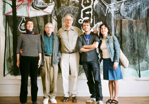
Juliana Cope (JC): Can you describe ISCP’s first Open Studios? When and where was it and why did you hold it? Who came and how did you promote it? Dennis Elliott (DE): The first Open Studios was in the fall, 1994 at ISCP (then known as ISP) in a half-empty warehouse on Greenwich St. in Lower Manhattan’s TriBeCa. It was memorable as there were only three artists exhibiting in their studios. With no common area to mount an exhibition, the studios seemed to be the only possible venue to present the artists’ work. Showing work in progress was a logical evolution given the mission of an artist-in-residence program. The Open Studios were mandatory as the sponsors wanted their artists to have exposure to the New York art community. Implementing Open Studios, Visiting Critics, Salons and Field Trips were not only desirable program initiatives but were part of the contractual agreement with the sponsors. For the first Open Studios (and for many years after), I mailed invitations with personal messages. It now seems quaint with the onslaught of social media. However, my demanding, “You must come!” on each invite actually worked. The participating artists designed the invites, which gave them more ownership of the event. The mailing list was only a couple of hundred names, compiled while I was administrating two other studio programs and with the contacts made during the first ten months of ISCP’s existence…. I would guess that about 150 attended the first Open Studios. Having hosted other Open Studios in the past, I was aware of the allure of refreshments—in my enthusiasm, I went to the absurd length of roasting turkeys and hams in my apartment the night before. November 1994 was the beginning of my ISCP Open Studios learning curve. While this foray into inviting the public was somewhat clumsy, it was also very heady and loaded with promise…. JC: ISCP has held Open Studios in various locations as it moved from TriBeCa to Midtown to Brooklyn. Have you noticed any interesting differences based on the building and studio spaces? DE: Physically and aesthetically, the TriBeCa and East Williamsburg buildings were similar. I was drawn to both for—among other things—the skylights allowing light and air into the central footprint, which was critical in affording more studio space and making the program viable. Both buildings had their charm. And, both were secured in a down market with extremely advantageous leases. The real estate gods smiled on me during the TriBeCa-lease negotiation. The bursting of the dot-com bubble had pretty much emptied the building. That and an ingénue managing agent’s first negotiation were unexpected gifts that allowed ISCP to be born in an enormous top-floor with practically no capital. Similarly, after viewing over 100 potential but unsatisfactory new homes for ISCP in 2007, a marathon lease negotiation resulted in ISCP’s move into an ideal facility in East Williamsburg. Again, favorable terms allowed ISCP to thrive. So much so that we were able to expand by developing another floor at the depth of the 2008 recession. However, our Midtown experience was fraught from the beginning with facility and lease issues. It was a mostly difficult seven years for ISCP. The silver lining was that it forced ISCP to stand on its own, form a 501 (c) (3) and nurture the beginnings of what has become an exceptional board. My concern for moving ISCP to Brooklyn was alleviated, once I discovered that NYC’s art community had preceded us. Being a stone’s throw from Bushwick compensated for our loss of the walking-access to Chelsea we had when we were on West 39th St. Also, moving into much larger, less expensive facilities allowed us to dedicate a decent amount of space for common areas, a gallery and a project room, thus permitting exhibitions, lectures, panels, conferences and the ability to provide space to academic institutions and other nonprofit organizations. This added a whole new dimension to the program, increasing ISCP’s visibility and community involvement. Acting as a community resource was not really possible during ISCP’s fourteen years in Manhattan. Of the many things that excited me about the move to Brooklyn, having a community to work with and being appreciated by it, were at the top of the list. Our current facilities have allowed ISCP to enhance its appeal and its work. The spacious studios, curatorial offices, open and efficient office spaces for the staff, common areas, three kitchenettes, bathrooms on every floor and ample storage area have helped make ISCP a destination for art professionals from all over the world. JC: Who were some of the most noteworthy Open Studios visitors throughout the years and what bonds were forged with them? For me, the most noteworthy Open Studios visitors were to be found in two categories: sponsors/potential sponsors and the diplomats/bureaucrats (mostly from the consulates and embassies in NYC and Washington DC). At many Open Studios: conversations were initiated, proposals were made and, best of all, deals were struck. Four that stood out were Anne Garneau, the great Cultural Attaché at the Canadian Consulate, who attended Open Studios many times and worked tirelessly to bring Canadian residents to the program, and who even procured funds from her communications budget in support of this initiative. Likewise, Jacques Soullilou, Cultural Attaché of the French Embassy, who deserves credit for attracting support from the French Cultural Institute for artists’ residencies at ISCP. Third, Francis Greenburger, who founded and built a major real estate company New York, has been a longtime supporter and sponsor of ISCP. Just after 2002, Francis and I even tried to initiate an ISCP outpost in Montreal, but political changes at the time thwarted our efforts. Finally, Edward Albee, perhaps my favorite noteworthy visitor, would come to Open Studios and spend hours with the artists, most of whom had no idea who he was. JC: From your position as a practicing artist what are the greatest values of Open Studio events? DE: Open Studios can provide much desired feedback for the artists and curators. The event provides a broad spectrum of visitors and potential for career-altering encounters. There have been multiple connections made at the Open Studios that led to inclusion in exhibitions, invitations to travel and one-person shows. Other than that, it is really motivating to have an audience for your work and the subsequent exchange of ideas that can validate your efforts in the studio. JC: ISCP used to be called ISP. Has having curators in residence changed the dynamics of ISCP’s Open Studios over the years? DE: I always felt that curators do the greater good. If one thinks that curators have little support now to develop their practice, back in the 90s there was none. Even our core long-term sponsors were implacable then about not underwriting curators’ residencies. Finally after much exhortation, the Netherlands took the plunge in 1999. Having curators in residence has been a potent stimulus for the program’s synergy. Just the exchange that goes on in the common rooms, studio visits, the programmed and social events have incalculable value. In addition, there are the outside influences the curators bring to the table: their research, writings, lectures, panels and exhibitions. The program’s mission is to nurture their practice and, in return, this experience can reap benefits for ISCP through association and visibility. Having curators make presentations at the Open Studios by giving a preview of their research brings in work of artists not in residence, which adds a further dynamic to the event and the program. JC: Do you know the history of Open Studios in New York City? Salons have been around for centuries but the idea of Open Studios is a little different. I am curious how you have seen this type of program change since the 1990’s. DE: The New York art community is much larger, more commercial and just different than when I started administering programs in the early 1980s. At that time, one could almost know everyone…it was like a cottage industry. But, as thousands of young artists and curators poured into the city over the years, the art community grew exponentially. Now, arts residencies have morphed into more professional and corporation-like structures, each with their own characteristics. ISCP has persistently maintained its support of artists and curators—that may seem an anomaly to many of the other art worlds that exist in New York. The Open Studios are the most visible component of how ISCP has grown and diversified over the last 20+ years. Note: This interview is edited and excerpted from a longer exchange that took place by email in March 2017. Image: Left to right: ISCP alumna Lene Berg, playwright Edward Albee, ISCP founder Dennis Elliott, ISCP alumni Damien Deroubaix and Valérie Mannaerts in 2008. Work by Deroubaix in the background.]]>
Concrete Complexity: When Data Visualization Gets Put to the Test of Materiality
March 01, 2018
by Gentiane Bélanger
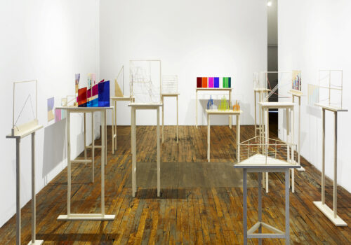
Each year, ISCP presents a solo exhibition of a current resident, which gives rise to the ideal conditions for productive curatorial collaboration. 2016 saw the dynamic artistic duo of Richard Ibghy and Marilou Lemmens scheming together with Kari Conte, Director of Programs and Exhibitions, to create a deeply engaging onsite presentation of their sculptures in the exhibition “Measures of Inequity.” The following essay by Gentiane Bélanger was commissioned by ISCP on the occasion of the exhibition and gives a sense of the overall effect of the dense installation of 18 works, which invited sustained viewing and thinking, and reflection on the economic, national, and political implications raised by the delicate sculptures on view. Bélanger’s astute essay below is a foundational text that grounds and contextualizes the artists’ work.
Concrete Complexity: When Data Visualization Gets Put to the Test of Materiality
New media theorist Lev Manovich argues that big data visualization is to the twenty-first century what photography and film have been to the twentieth. Manovich considers big data visualization’s exponential rise over the past fifteen years as a profound epistemological and aesthetic paradigm shift, from a reductionist and linear approach to knowledge to an embrace of interconnected complexity.[1] Essentially deriving from Cartesian geometry—with most charts conceived from a plane defined by x, y, and z axes—classic diagrammatic language tends however to interpret complex phenomena in a reductionist fashion. Most current data visualization follows this principle, as evidenced by the standards established by one of today’s foremost infographics theorists, Edward Tufte. Good infographic design, Tufte asserts, is a marvel of economy and spatialization, revealing data through a minimal layout uncluttered by contextual paraphernalia. For Tufte, best practices in information design amount to an act of distillation or excavation, removing all relativist and ornamental muck—what he terms chartjunk—to get down to information’s objective bedrock. Diagrams should not be interpretive in themselves, but should rather support robust interpretation by visualizing connections between otherwise indecipherable data. “What is to be sought in designs for the display of information is the clear portrayal of complexity. Not the complication of the simple.”[2] Tufte’s reductionist view is expressed through nine principles of excellence governing “graphical elegance”:- Show the data.
- Induce the viewer to think about the substance rather than about methodology, graphic design, the technology of graphic production, or something else.
- Avoid distorting what the data have to say.
- Present many numbers in a small space.
- Make large data sets coherent.
- Encourage the eye to compare different pieces of data.
- Reveal the data at several levels of detail, from a broad overview to the fine structure.
- Serve a reasonably clear purpose: description, exploration, tabulation, or decoration.
- Integrate closely with the statistical and verbal descriptions of a data set.[3]
- Show the graphics.
- Induce the viewer to think about the substance, methodology, design, technology, and aspects of production, dissemination, and consumption.
- Highlight the manipulation of data in every representation.
- Present many graphic elements in a small space.
- Attend to incoherencies in large data sets.
- Encourage the eye to compare different visual arrangements of the same subject.
- Reveal epistemological differences produced by changes of scale.
- Clarify the purposes and implications of data representations.
- Show how verbal and graphic devices interact in data representation.[15]