Journal

Tagged: ""

March 08, 2016

Kari Conte and Michael Jones McKean in Conversation

by Houda Lazrak

This conversation from ISCP’s archives took place between ISCP alumnus Michael Jones McKean and Kari Conte at the conclusion of McKean’s 2010 residency.

Kari Conte (KC): Your work often combines artifacts with present-day objects – what is your interest in creating this recontextualization?

Michael Jones McKean (MJM): I like how time embeds itself inside objects very differently. Take an iPhone, it has a very particular time signature, a steep one, so that today when we look at an iPhone 4 it lives on the edge of newness, but in five years it will look positively archaic.  On the other hand, a meteorite, a piece of petrified wood or a Windsor chair all have more protracted time signatures – they move so glacially through a continuum we can’t understand their time stamp. By docking and grafting different kinds of objects together I’m trying to build an object harmonic that collapses some imposed hierarchies, builds some new metaphors and hopefully finds a fragile, momentary solidarity between objects.

KC: For your work included in the Quebec City Biennial you purchased 50 acres of land in Canada – what was the impetuous behind this project?

MJM: I got very interested in a relatively small piece of land in Northern Quebec in a remote area about 400 miles north of Montreal. The site is in the middle of hundreds of square miles of forest. Not surprisingly one of the major industries in the area is logging, so land use has a direct and palpable relationship to the area’s economic well being. To complicate matters – the land I purchased was nearly entirely clear-cut – rendered essentially worthless in the relation to the local economy.

The region has this peculiar feeling of being deeply isolated, yet everywhere a human imprint is aggressively visible.  Imagine driving 16 hours through mountains and forests, 3 hours on dirt roads to arrive in this primordial land with no sounds, no people – yet you find yourself within an endless grid – a forest of trees gridded for cost-effective harvesting and management. But everywhere within this engineered reality nature is silently trying to reclaim a more fluid, if to us, chaotic order. The experience was totally uncanny – like something out of some Borges story.

KC: Why Canada?

MJM: The project compressed all these small artifacts from around the world and I wanted to have an actual, real section of Canada in the work. When I say it, it sounds extreme, but there was something very logical to me about this decision.

For the exhibition I was given this funky space in downtown Quebec City. In it I organized a black lacquered piano, a hand knotted rug from Afghanistan, a meteorite from  Argentina, a piece of petrified wood from Arizona, some bags of topsoil, Nivea skin cream, Tiger Balm ointment, orange juice and some Evian water I bought at a dollar store across the street. After these objects were in place, I arranged on the floor two groupings of Polaroids I took of the land. These Polaroids were then re-photographed creating a photographic doubling of the space. For the exhibition the original Polaroids were removed leaving this nearly invisible gesture – photographs of photographs – as the only evidence of the land. They became a fragile echo, a nearly undetectable hinge psychically binding the land within the installation.

The idea of ownership factored into the project heavily, a concept that has lived in previous projects as well. I think when you divest yourself of liquid capital and trade it in on object, a thing, a certain amount of bullshit melts away. Something abstract becomes factual, definite, and direct. By extending an artwork into the realm of stewardship, one becomes not only conceptually invested, but also physically, legally and economically wed.

KC:  So what will you do with this piece of land?

MJM: I’m going let things revert to a more nature order. The idea that within this huge forest of bastard trees exists a small plot of land that disobeys the surrounding logic, unaffected and undomesticated is very exciting to me.

KC: There are a few great precedents of artists buying pieces of land.

MJM: Sure there is a long history – like Gordon Matta-Clark, Andrea Zittel, Judd, Roden Crater, more recently Rirkrit Tiravanija.

KC: Often your work very specifically points to the origin of the materials that you use–for example petrified wood from Arizona, an Anthropologie blouse, OP (Ocean Pacific) windbreakers – what is your intention in this specificity in the representation of your work as opposed to a description of ‘mixed materials.’ It seems like a key part of how you present your work.

MJM: In some small way I’m trying to understand our conceptions of materiality and the ways that meaning attaches itself to objects – hermeneutics, semeiotics, economics, poetics, emotional, spiritual, political, gendered, commercial, racial, erotic, the list could go on. So an Ocean Pacific windbreaker operates as a placeholder for several kinds of emotions and concepts that conjure a very different discourse than say the reverie a Starter Jacket evokes. But really your question is about relationships – each object, each technique, each material has many jobs to do conceptually and compositionally within a sculpture. They are finding a way to be in concert within a field of other objects and techniques and images where nothing is ever neutral.  And there is nothing algebraic about this arrangement – I feel like I have to relearn everything each time I make something.

KC: You produced an 80-foot rainbow over your studio in Virginia – how did this project originate and what was the trial and error process?

MJM: I started working on it almost eight years ago. It spawned from an accident while I was documenting a project that contained a misting component – suddenly a faint color prism appeared, very much by accident. I put a memory-hold on that moment with thoughts that maybe there could be a way for an actual rainbow to exist within a project. A few years later I was working on a public project and was struggling with how to reconcile the way my work behaved indoors within sanctioned art spaces in relation to a more borderless outdoor space – the translation was failing. This crisis dug up the memory of my accidental encounter with the rainbow. I began to think that if I were to ever work on a public project again it would be a huge mistake, a missed opportunity really, to simply tweak my work, whose DNA is so bound to the rules of codes of galleries and museum spaces to fit into the public realm. The rainbow was something that could operate on a civic scale, yet be spatially untethered, placeless, fleeting. Born out of a crisis, that epiphany stirred up a list of technical problems to be solved to make it actually work, ones I’ve been working on for years now…

There’s open-endedness to the rainbow that’s very attractive to me. The project doesn’t settle down as one might expect into its more kitsch, graphic symbol – it lives as an actual rainbow does, ghostlike and strangely unknowable in all its phenomological insistence.

KC: The British artist Simon Fugiwara creates fictive archaeological digs that also reveal his own history and identity is subtle ways. Your cv indicates that you were born in Micronesia –  does your work also include elements of autobiography?

MJM: Some artists embrace autobiography as their subject matter – it becomes part of the content of their work, how we’re intended to engage the work.  I don’t use biography so explicitly in my work, but of course I can’t escape all the things that make up who I am: the books I’ve read, the people that I’ve met, stories I’ve been told, technology that I use, all the tacit yet essential details of one’s life like growing up in an empire or always being able to plug stuff into a wall and energize things. These details become part of the white noise we’re enveloped within while making work – I’m just not trying to modulate that noise so specifically as to render it the content of my work.

KC: But it seems also like your work, somehow must be tied to this fact that were born there and this kind of epic exploration and adventure…

MJM: It is possible, but I also wonder if this has something to do with our yearning for more cogent narratives.  That said, I totally agree that being born on a remote island in the Pacific is a hard bit of biography to escape. I remember having this big globe in grade school growing up. All my classmates would point out where they were born, most found a small section along the eastern seaboard – Michigan was unbelievably exotic… But to spin the globe totally around and say “I was born there” – that was crazy.

KC: I was wondering how you approach the systems and the ‘power of display’. In some of your work, you include objects that are reminiscent of pedestals and in other work you include vitrines. So, are you interested in the underlying politics of display?

MJM: I’ve always been interested in how objects and object placement can work as signifiers and this, in someway, relates to the politics of display. But when I think about the phrase ‘politics of display, and even ‘signifier’ it conjures up this discourse that seems late – like it had a moment. Not that the intellectual kernel of those queries aren’t relevant to us anymore – it is more that the language we have borrowed and constructed to discuss them has ossified their development and meaningfulness for us today – but this is tangent…

On the most basic level a sculpture is simply a small, volumetric displacement that has a slightly different gravitational pull than the space the sculpture sits in – a slight shift in harmonics. Sculptors try to manipulate this harmonic  – if one puts an object on top of a table there is different kind of politic involved than deciding to put it on top of a white MDF cube. Arranged objects in a grid perform differently than a pile. A vitrine? A shelf, mosaic or veneer, knee high or waist high, a stage or a plinth, a flower on a fish stick box – it’s endless yet these decisions makeup the essential DNA of a sculpture. When we look at an artwork we are really standing in front of a series of ‘yeses’ that the artist made. But this narrow bandwidth of ‘yeses’ is miniscule in relation to the overwhelming number of ‘no’s’- some silent and already determined, others in play, hard fought and painful, to make a work manifest.

KC: You’ve shown your work a lot outside of ‘art centers’ in the US. Can you illuminate on the trajectory of your career and practice working outside of these ‘art centers’ in more regionally based institutions?

MJM: It wasn’t a strategy to exclude places like New York or Berlin or LA early on – my logic was more straightforward – I simply worked on projects where people asked me, but this is how most artists work. In retrospect, I suppose in many ways the arch of my practice has not followed a typical path. I went to a small liberal arts college in northern Pennsylvania where I played basketball for four years – from there I got a masters degree in ceramics. I was lucky to get a few residencies right out of grad school, but they put me in locations far outside art world hubs – off-the-grid places like Provincetown, Omaha, Kansas City, Montana, Central Michigan and to a lesser extent even Houston.

KC: I imagine that working in a place like Kansas City gives you the opportunity to build large-scale new commissions that might not happen at such an early stage in your career if you had not gone all over the country bit rather worked in New York.

MJM: Yes, I think that’s true. I’ve been fortunate to make some large-scale projects, ones that probably would have been impossible to make if I had moved directly to New York City after school. One’s conception of space is so different when you live in New York City versus, say, Omaha. It is not that one city grants more psychic latitude to work more ambitiously, it’s just that in Omaha it is actually physically and economically easier to pull off larger materially based projects. But it is also essential to remember that this ease is purchased at the price of other important things that New York City affords to artists…

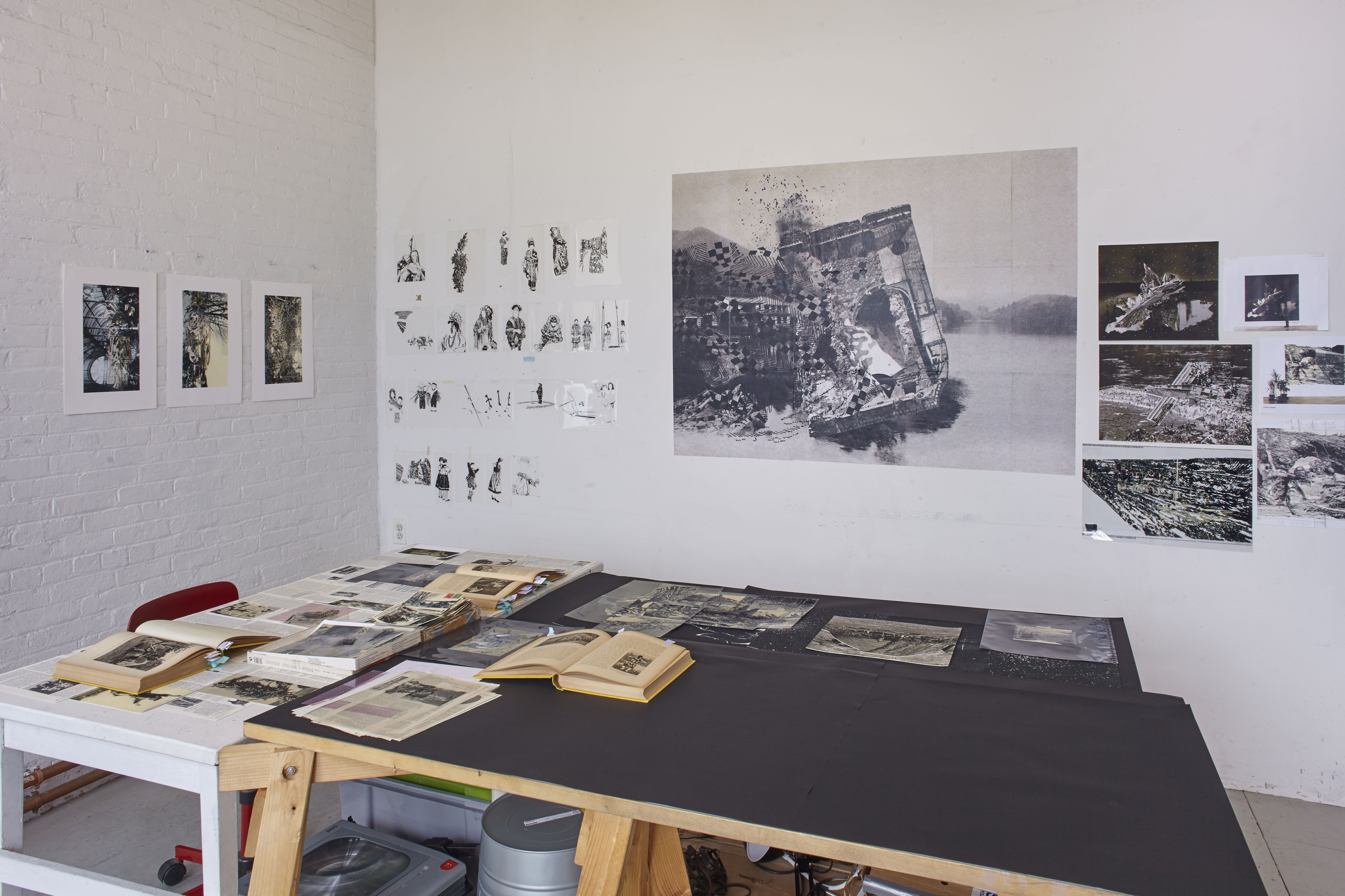
KC:  You generally tend to work very large-scale. The size of your studio at ISCP has necessitated that you work on smaller-scale projects – how has this affected the way that you work?

MJM: Moving here I knew that my studio would be smaller than where I’ve recently been working. That said, I showed up at the ISCP interested in trying to make some smaller, more discreet sculptures. I got into a very solid rhythm and ended up being very productive. I suppose in a classic sense the restraints created a fruitful tension that  freed me to make some work I probably won’t have given myself permission, or even thought to make at my studio in Virginia. It’s counterintuitive, but working in a small space actually opened up a lot things for me.

August 18, 2016

Interview with Nicole Franchy, ISCP Ground Floor Resident, July 2016

by Juliana Cope

This is a conversation between Nicole Franchy, Ground Floor Resident at ISCP since 2015, and Director of Development and Programs Manager, Juliana Cope.

Juliana Cope (JC): I would like to talk about your practice, but also your experience here as a resident at ISCP.  Let’s start with what you do.

Nicole Franchy (NF): For a while now I have been working with images and texts related to travel and history. More recently, I have been focusing on encyclopedic material. I was always fascinated with the idea of representation and translation.  I am intrigued with how we extract images and information from different knowledge systems, in particular those constructed from a western framework.

Over the years I have built an archive that I employ in various ways.  Sometimes I use the images in my archive directly, and others, I scan and excerpt information from the “original” context, which I then reconstruct into what I call “Associative Landscapes.” I am surrounded by these materials.

JC: How do you organize the images and your collection?  What do you mean when you say you’re surrounded by them?

NF:  I keep them in drawers in my studio and also laid out on tables around my studio, and well, most importantly, I memorize them.  When I began, I would take the images I collected and catalogue them; then I’d repeat the process by inventing different ways of classifying them over and over again. Throughout the process, I would end up memorizing the images. It has gotten easier throughout the years and this process now occurs somewhat unconsciously. There is an entire transformation that happens on my studio tables by cutting, collaging, scanning, inverting and drawing from my material. Translation, memory and the idea of place are quite present in my practice.

JC:  So when you talk about memorization of images you’re thinking not just of individual images but also their structure and the iconography.

NF: Yes, I learn the images and texts, and then try to unlearn them or think of them as patterns out of their context or source material.

JC:  What are you reading now?

NF:  I am currently re-reading certain passages of Tristes Tropiques by Claude Levi-Strauss, The History of the XXth Century by Eric Hobsbawm and a small essay called Can The Subaltern Speak? by Gayatri Chakravorty Spivak.

JC:  This makes sense; you are not trying to create a direct one-to-one correlation.

NF:  Not really.  The works end up being re-constructed landscapes of fictive memory mostly from archival photographic material. It´s quite amazing to see viewers  encounter my work as they try to make sense of a place, or try to find a point of reference within these landscapes.

Right now, I’m working with a German ethnographical atlas called Die Grosse Volker Kunde from 1936. I´m excerpting from the publication the portrayal of groups and individuals. I am purposefully leaving out human features and excerpting only clothing patterns, accessories and tattoos. I select the images, cut them, invert them, and transpose them into various scenarios. It starts to get pretty layered. I am now focusing on a site-specific project that has been a work in progress since last year. I will be exhibiting the final pieces this upcoming September at a gallery in Bushwick called The Chimney.

JC:  I don’t think I’ve ever seen you work with people before.

NF:  No, this is something new for me. I’m glad you noticed. I’m struggling with it because I’ve mostly worked with landscapes before and this seems so specific and complex due to the sensibility of the content.

My interest in landscape departs from its representation by travelers and naturalists. My early works mostly revolved around power or empowerment through the portrayal of landscape. In a sense, I was somewhat ironically using photographic material to imitate these grandiose landscapes. I was also recreating scenarios from text-based descriptions of travelers but rather than depicting the vistas of their travels, I was using their hometown landscapes. I was also imitating recurrent print motifs by using postcards images, such as waterfalls or volcanoes.

JC:  You have been a resident at ISCP twice now. How has your work changed over that time and have you had any particular influences? Your practice seems more studio-based now.

NF: I began working with archival material in 2009 and with this specific kind of material since 2011 during my postgraduate studies at the Higher Institute of Fine Arts (HISK) in Belgium. Since I became a resident at ISCP, I have spent a lot of time in the studio. There is also a sense of perspective when you return to your work after relocating to a new country. ISCP has given me the opportunity to speak with curators and scholars about my work, which has definitely anchored my practice. It’s a very different experience than being here in New York and working alone. Being at ISCP has given me the opportunity to start building a network with academics as well as with peers from all over the world who are also in residence. I have this whole context that’s sustained my work at many different levels; curators or artists can write to me saying, “Hey I was checking on the website and I thought your work was interesting and I’d love to do a studio visit.”  There was a wonderful artist who visited my studio last month, who reached out to me through ISCP’s website. I also had a class visit led by scholar, sociologist, and artist Hakan Topal from the School of Visual Arts. I think these have been some of the most rewarding and fulfilling experiences in New York. Then of course, there is all that the city has to offer, the field trips organized by ISCP, and the workshops with art professionals, as well as the support by ISCP staff members onsite.

JC:  You gave up your stability in Peru to come here.

NF: You leave your family behind. You leave your friends behind. I left Peru in 2009 when I moved to Europe and, although I’ve gone back for a period of time, I have been moving around for a while. It takes a lot of energy and it is a lot to deal with of course. Being in a place like ISCP though, where you receive feedback about your practice, and easily become friends with other artists and curators is extremely rewarding.

JC: Has New York itself been an anchor? Do you feel like you’re using local resources such as research centers or university libraries?

NF: I started doing research at the New York Public Library. I am not doing it right now because I´m working with this specific publication, but it is great to have these amazing resources at your fingertips here in New York. There are always research-focused times and then there’s work in the studio. At times they overlap.

I was also invited by curator Rocio Aranda-Alvarado to talk about my work at El Museo del Barrio earlier this summer.  It was great to meet Latin American artists based in the city, getting to speak to them, and learning more about their work.

March 03, 2017

MARTINE GUTIERREZ: JEANS

by Houda Lazrak

This is an interview with Martine Gutierrez, Van Lier Resident at ISCP from August 2016 to February 2017, by Houda Lazrak

Houda Lazrak: Is JEANS, at 37th Street and 9th Avenue in Manhattan, on view December 5th, 2016 through January 15th, 2017, your first large-scale billboard project?

Martine Gutierrez: Yes! I have been wanting to do a billboard for a long time. Two years ago, I produced a large-scale installation called RedWoman91 with RYAN LEE Gallery for their window space on the High Line in Chelsea. The piece was a site-specific video that read somewhat like a billboard due to its scale and color. It addressed the digital interrelationships of online personas related to social media and chatrooms, but also individuals’ acts of curating their online presence. The title RedWoman91 can be interpreted as an email or username for a web persona and the character’s performance is congruent to a livestream in a chatroom. There is a noteworthy shift between RedWoman91 and JEANS. In RedWoman91 the performance is mirrored back to the character as she performs for herself in a live camera. With the adoption of a supermodel role in JEANS though, the performance is directly geared to a large and unpredictable audience. There are more similarities than differences between the two campaigns. I am using the mechanisms of billboard advertising and marketing color schemes to host performances of non-binary gender representation in a consumable way. To the unsuspecting eye, JEANS is a real billboard that puts forth an existing product by a seemingly cis woman—it’s all very stealth. If I hadn’t already been wearing a red catsuit in RedWoman91, I would have used red; pink is such a gendered color.

HL: So the color pink was not the initial color of choice at the start of your creative process?

MG: Well, initially the billboard was going to be a different fake campaign, a boots campaign that I am also working on for my magazine Indigenous Woman. The boots are called ‘identified boots,’ and have almost every queer symbol inscribed on them. I shot that campaign and later learned that the proposed billboard would not fit the image. So I shot the JEANS campaign. Originally, I wanted the image to be black and white, which is very classic, very Calvin Klein 1990s—but noone looks up in New York, including me. I had to find a way to pull viewers’ attention away from their phones and get them to look up five stories. That’s when I knew I had to show some derrière cleavage and infuse a bold marketing color to attract attention. I still wanted to have the campaign be in black and white though.  At the time, I was looking at makeup ads, such as Maybelline or Cover Girl, and saw a lot of lime greens and hot pink colors—acidic shades that were reminiscent of fruit, like watermelon and oranges. I came to be satisfied with the pink backdrop, like it is now, but had the text in lime green. I didn’t like it. My aesthetic is definitely ‘less is more’ as opposed to sassy and loud so I decided to revert to black and white text.

Also, you can see paint strokes on the image, which I photoshopped in. I knew the mark of the hand would be missing in the billboard’s mass printing and installation but I wanted to make the nostalgia visible. I pre-fabricated romantic gestures of dripping glue, brushstrokes and other accidental human residues to counter the mechanical precision of digital work.

HL: You’ve touched upon this already but are you referencing any specific ad campaign, particularly in your choice of jeans as the product you are selling?

MG: Denim as a fabric and the way denim has been used in the history of fashion advertising is so interesting to me. Denim is often looked at as the poor man’s uniform, in part because of the large Latin community who wear denim while working in the United States’ agricultural industry. There is a history of blue jeans being distributed in prisons to identify convicts. It is also still prevalent in terms such as ‘blue collar’ to identify the working class. Jeans remain a strong iconic American status symbol though. I have friends who have travelled through South America with only a suitcase of name brand secondhand jeans, such as Levi’s or Tommy Hilfiger, so coveted that their sales financed the entire trip!

The reality is that I’m not selling jeans. When you strip away the jeans, you are left with only ‘Martine.’  My performance as a supermodel is convincing but I am just as immaterial. I am not a brand or a celebrity. My work has always stemmed from the reality that it does not serve as a definitive statement on gender. Instead, my art has been cultivated into a language for self-reflection and understanding of how I identify in the world. This is partly because of the tension between my gender and my Guatemalan heritage, which is challenging to navigate in a genuine way. Unfortunately, much of how we perceive ourselves relies on others’ perceptions: validations of beauty, gender identities, self-worth, success, etc. Society perpetuates these normalcies as truths. Without care, we end up performing echoes of historical characters and hollow stereotypes.

HL: In a lot of your work you embody a specific persona or role. Did you come up with a particular character for JEANS too? Who is she?

MG: She is definitely a supermodel. But I don’t think it’s the farthest stretch to say she is more familiar to me than other characters—but very sexy! I was trying to play an ambiguous model. Someone who is cool enough to be seen in today’s media without referencing one particular supermodel.

HL: You also speak about her as both the product and the consumer.

MG: Yes, I am actually referring to myself when I talk about being both the product and consumer.  I am confronting control to have ownership over my body and how it is used as an underrepresented identity—and to have authority over what I’m selling and what the advertisement looks like. I am fully versed in the confrontations that follow the spectacle of my gender. I therefore utilize large public installations such as JEANS as an opportunity to take back my power. It is rare for the media not to use the label of ‘brown, transgender woman’ as buzz words as they project upon me the stereotype of my own exoticism.

I know my distinct identity has given me many opportunities. People are interested in placing me in a box and saying, “look at this person, isn’t she interesting to figure out?” But I know a lot of people, with whom I share parallels, who find themselves in positions with few opportunities to be heard. Even if a platform is available, they have little to no control over how the content is used. As a minority entering the mainstream (the straight white world) we find ourselves labeled as the other. I would never create a billboard that said “she or he?,” or something equally lacking sensitivity. Even though last year was considered the year of transgender awareness, the undertone of many trans-themed features still read along the lines of ‘look at the beautiful freak.’ The focus was on the individual’s gender, and the transformation to becoming a woman. When do we ever say, “Kate Moss, white model, born female”? It shouldn’t feel necessary to describe me, or any another LGBTQ or non-binary person of color, by my gender or ethnic background.

HL: What about the makeup? Were you trying to achieve a specific look with it?

MG: The makeup… I had a lot on! I had smoky eyes, a glossy lip, gelled brows, and some contouring on my nose and cheeks. For years, I compiled binders full of my favorite fashion magazine pages with little idea of why I found the imagery compelling, whether it was a color palette, the makeup, or the inspiring locations on private estates. They now serve as tools to learn how a model holds her body or references product placement. Though makeup trends vary, depending on the era and the brand, I see definite similarities between how makeup is used on a woman’s face —which shapes and features are celebrated and considered feminine.

HL: It is obvious that JEANS is in the middle ground between art and commerce. Were you thinking of incorporating the two while creating the work?

MG: I think this confluence has been gradual with time. The first video I made with a real connection to commerce was a music video for my pop star persona where I feature a white BMW convertible—the video could easily be mistaken for a BMW advertisement.

I inherently have an aesthetic that could be paralleled to fashion imagery or product merchandizing; I depend on my constructed fantasies to convince viewers that they should rest on their preconceived notions of what they are seeing. In reality, things aren’t what they appear to be: locations are sets, people are mannequins, I was not born female. Up until two years ago, I used predominately male pronouns. I am interested in how the fashion world builds glamorous settings. The transformation of products and models, specifically women, have always escaped reality in a way I find aspirationally inviting.

HL: Can you speak about the gendered visual cues in the image? By this I am mainly referencing your derrre cleavage and what it represents in terms of gender politics.

MG: The fastest way to answer this is: “kiss my ass!” If your question had come from a seemingly entitled, straight white male, that would have been my answer! I would flip my hair and walk away. But I’ll delve a little deeper here…

When selling anything, there is an unspoken commitment to selling sex at the same time.  This is true for fashion, cosmetics, cars, and produce. I mean, don’t get me started on Chiquita Banana! It’s part of marketing anything – it’s sex sex sex. In the past, I’ve shot several portraits wearing feminizing makeup and I showing my boy chest; it was quite jarring. Since I started hormone replacement therapy, I feel less and less the need to feminize my gender because features that were once masculine are now veiled by soft round flesh. I feel the need to nurture and protect myself as I am only budding—my derrière at the moment is the most familiar currency I have to showcase.

At first I shot a lot of images with the pants buttoned. Only in the last couple frames did I unbutton the pants and pull them down. Comparatively, the last images felt much more dynamic and a lot riskier.  The small of a man’s back doesn’t have the same currency that a woman’s does. Because my body reads so feminine in the JEANS image, it becomes more charged. If I had my scruff and my happy trail and was poised in the same position, where would the viewers’ attention go? Would they still see me as feminine? Probably not. Does it make me an activist to use my gender to say, “Look at me, I’m non-gender binary?” I don’t know, but I don’t want my identity to ostracize the conversation.

HL: So why do you want people to look at this image?

MG: Well, I want to be famous! No, I’m joking… I want validation. I want to feel extraordinarily ordinary. I want this billboard to address the obvious: public gaze and self-exhibitionism, and my use of mechanisms of consumerism to fabricate a non-existent brand. The craftsmanship with which I execute my practice should be at the forefront of the conversation. These topics would be the meat of the press if I was a straight, white or cis male artist.

HL: Finally, can you explain the campaign hashtag #martinejeans. Are people going to find anything if they look up that hashtag on social media?

MG: #MARTINEJEANS! At first I was thinking about putting one of my websites on the billboard but I don’t want to promote myself in that way. Modeling is not an aspiration of mine, though it is a skill I am interested in honing for my work. The hashtag seemed like the best navigator to produce content for the project and guide curious viewers to find more information about my practice. #martinejeans leads to a collection of images on Instagram. It connects to all my other posts regarding JEANS, like #behindthejeans. If anyone uses the hashtag when posting an image, it will automatically be part of the project on Instagram. The hashtag could even link to this interview, making it evident that it isn’t a real advertisement for jeans but an installation brimming with commentary.

Journal

Tagged: ""